Fernwick Foods rebrand
A new identity and packaging system for a regional grocery brand, built to be recognised on a crowded shelf.
-
A closer look at the work
The problem
Fernwick had grown from one shop to forty, but its packaging looked like forty different brands. Customers could not tell its own-label products from the rest.
What needed to be done
Create one identity and a packaging system that works for a tin of tomatoes and a box of tea alike.
How the right problem was found
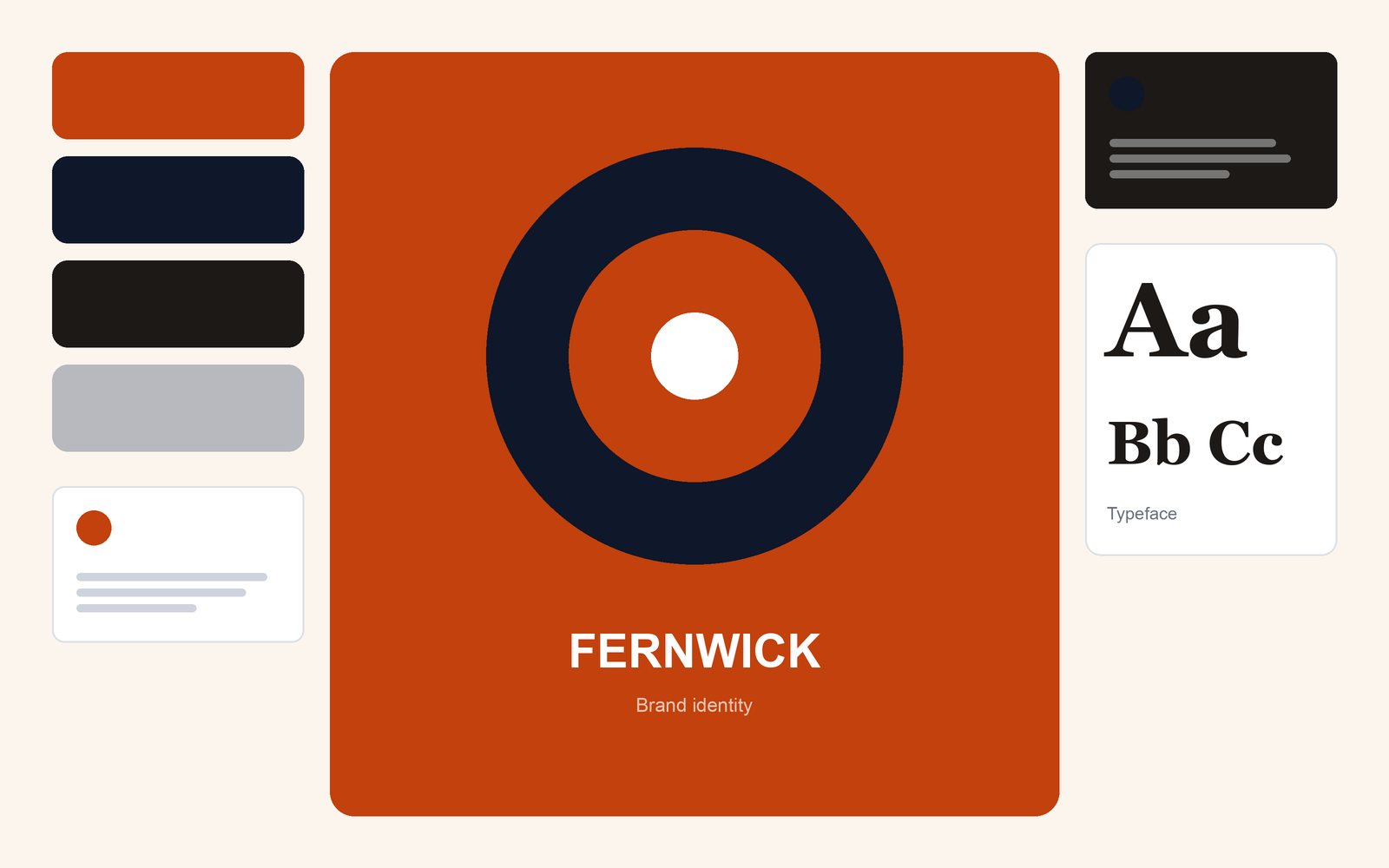
I photographed the shelves of six competitors and noticed that everyone used green. We chose a warm orange and a bold ring mark so Fernwick stood apart, then built a grid with room for product photos, recipes and allergens.
The outcome, measured
The rollout reached all own-label products in nine months and the team now produces new packs in-house from the system.
- 120+
- Products redesigned
- +16%
- Own-label sales after the change
- 2 weeks → 3 days
- Time to produce a new pack
Skills and tools
Methods
Competitive analysis
Tools
Adobe Creative Suite
Also
Storytelling