Casa Alba Hotel identity
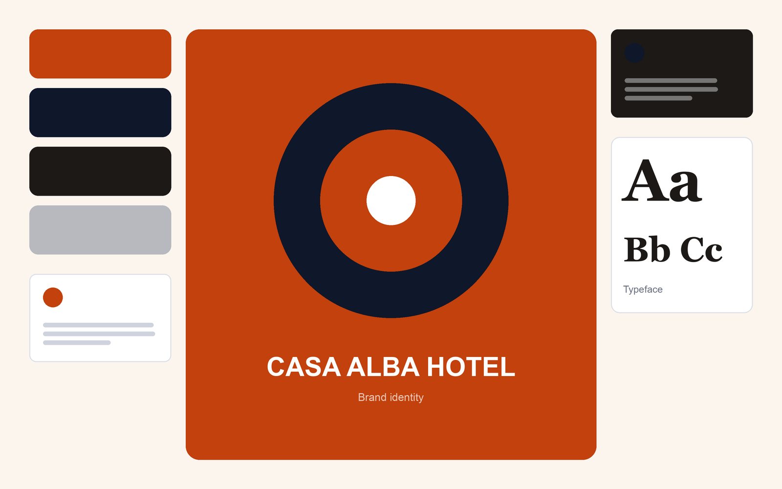
Signage, menus and a booking site for a family-run hotel, drawn from the building’s own tile patterns.
-
A closer look at the work
The problem
The hotel had a fine reputation but an inconsistent look: three different logos across the sign, the menu and the website.
What needed to be done
Unify the guest experience with a single identity that feels local and warm, not corporate.
How the right problem was found
I walked the building with a sketchbook and drew its floor tiles and door carvings. These became the pattern language, used sparingly so that rooms felt calm. I tested printed menus with guests at breakfast and adjusted the type size twice.
The outcome, measured
Guests commented on the consistency, and direct bookings through the new site grew.
- 3 → 1
- Logos reduced
- +21%
- Direct bookings (first year)
Skills and tools
Tools
Adobe Creative Suite
Also
Storytelling