Brindle & Oak: a studio identity
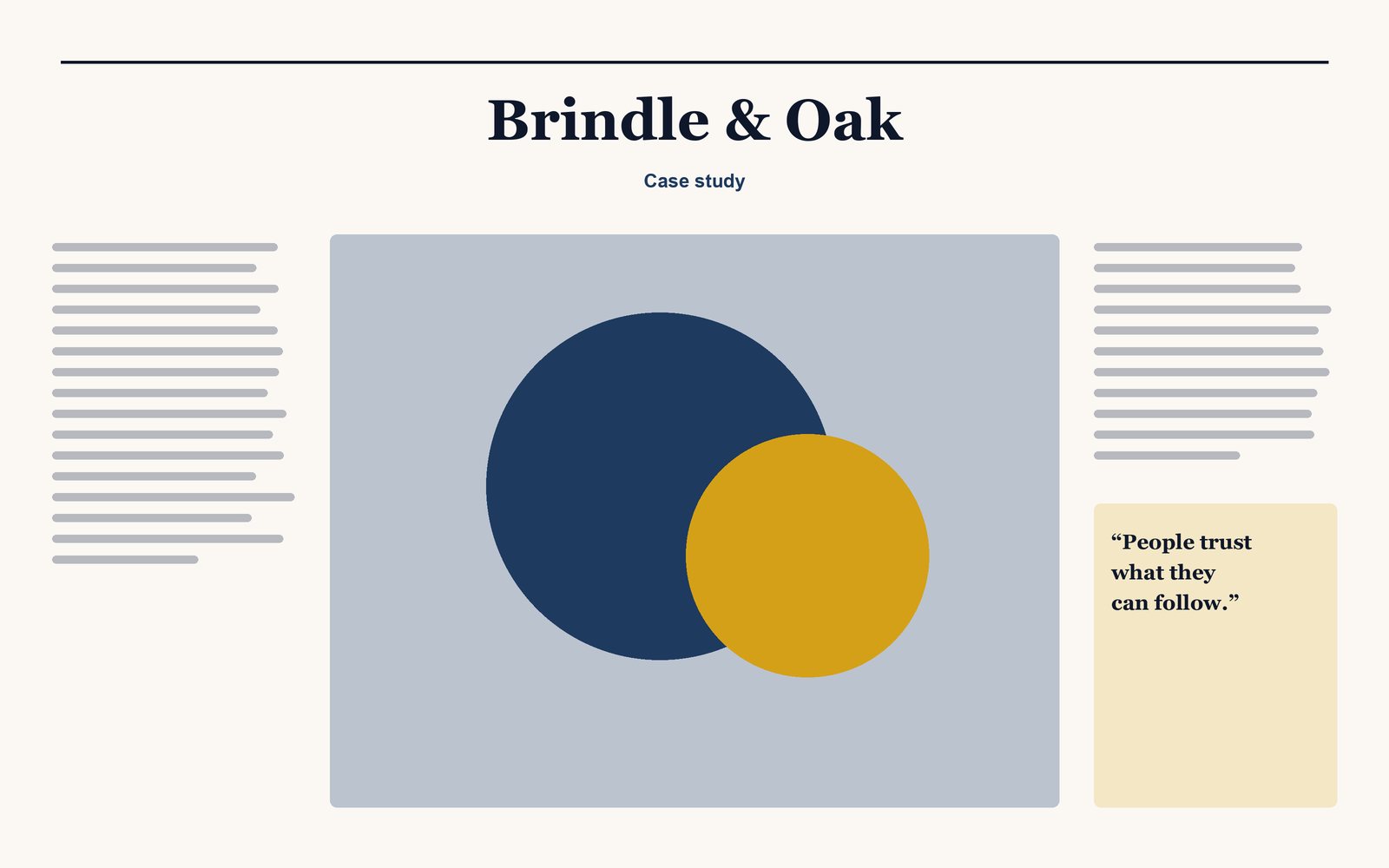
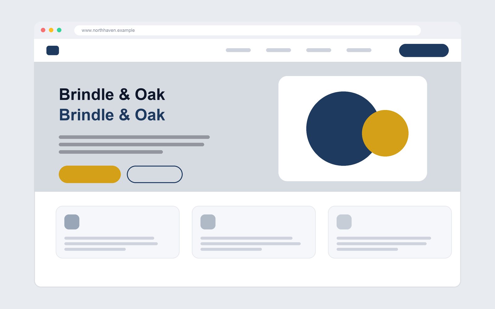
A confident, typographic identity for the studio itself, designed to flex across proposals, social and print.
-
A closer look at the work
The problem
The studio designed identities for others but its own looked dated and inconsistent.
What needed to be done
Create a simple system the whole team could use without asking a designer each time.
How the right problem was found
I reduced the identity to one typeface, two colours and a set of layout rules, and documented each with examples of correct and incorrect use.
The outcome, measured
Proposals now look consistent, and new hires pick up the rules in an afternoon.
- 1 afternoon
- Time to onboard on brand rules
Skills and tools
Tools
FigmaAdobe Creative Suite